 |
| New Look for Google Drive |
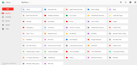
Let's take a look at some of those changes and help you get acquainted with this new look:
1. Shared with me - This is now referred to as "Incoming." It is still in the left-hand column directly under the My Drive folder. When you click it on, you see the documents listed as...
- This week
- Last week
- Older
When you look at the files themselves, you will see who shared the file first followed by the file name. If you have added a file to a specific folder you created in Drive, it will show you that information too.
 This is all you will see until you place your cursor at the end of the file. Then you have options for downloading the file, adding it to My Drive (if you haven't already done this), and more actions (the 3 little dots). Your options under more action may be limited due to the defined sharing settings given to you by the owner of the document. If you can only view or comment on the file, then the Share and Rename options are grayed out. The Share icon will even have a line drawn through indicating that you cannot share that file with other people. Also under more action is Open with..., which allows you to choose what application you want to use to open that file. Naturally, if you just click the file it will open for you in Google Drive or in a preview window.
At this time, I have not found a way to sort your Incoming files by owner, so all the files are sorted by date.
 |
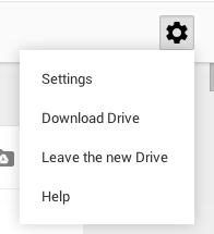
| Settings Icon |
You can also Download Drive to your computer from this location. If you recall, you had to choose Install Drive, which was tucked away under More in the left-hand column.
Currently, you have the option to experience or leave the new Drive under the settings icon, but that option will go away soon. My suggestion...embrace the change now.
 |
| New Button |
4. Working with Files - Before the new look, a single click on a file or folder would open it up for you. If you wanted to select a file or folder and do something to it (move to the trash, share with other people, etc.), you had to click on the check boxes. Now, a single click simply selects that file or folder so you can make changes to it. You can even select multiple files or folders by holding down the command key (on a Mac) and click what you want to select. If you actually want to open the file or folder, you have to double click.
Another change is where you go to make specific changes to files and folders; changes like sharing, organizing, previewing, etc. In the old look, all those features were located under the word More at the top of your Drive. Now the those options are available through icons at the top of your Drive and via the 3 little dots, also at the top of your Drive. Check out the differences in the two images below...
 |
| Old Look |
 |
| New Look |
 |
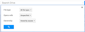
| Advanced Search Options |
Want to try out the new Google Drive?
- Go to the Settings icon - looks like a gear wheel on the right side of your Drive screen
- Choose Experience the New Drive


CHECK IT
ReplyDeletegmail helpline number uk
gmail support number uk
gmail toll free number uk
gmail contact number uk
The content is the king and one should remember that very well not just while writing blog or article but also while working on the design and development of the website. How to Sign Up For Netflix | Backup Yahoo Mail in a quick way
ReplyDeleteyou can read more
ReplyDeletekaspersky helpline number uk